The brief came over dinner: two founders with serious experience in pharma logistics and direct marketing, and a brand that undersold the work behind it. They wanted to evolve it without losing what was already working.
Tannit is one vendor for design, production, and delivery, but the identity didn't read that way. Dense illustrations, muted colours, and layered visuals that signalled complexity rather than capability.
Three things had to happen at once: reduce the visual noise, protect what already worked (the triangle, the tone, the equity the founders had built), and create one system that could speak to two completely different audiences.
These clients work inside regulatory frameworks and long approval chains; the brand needed to carry the same weight as the materials it supports: precise, undecorated, trustworthy.
InstitutionalData-firstRigorous
These clients want white-label execution: Tannit handles production, the agency presents the result. The brand needed to read as reliable and unobtrusive, without competing with the client's own identity.
White-labelFrictionlessInvisible
Built for two worlds.
Designed as one
Each choice came from something specific: a problem with the existing identity, a need from the audience, or something worth keeping from what was already there.
Montserrat for authority.
Helvetica Neue for clarity.
Geometric sans-serif chosen for headlines and brand statements. From Light to ExtraBold, its weight range covers every tone in the system without needing a third typeface.
Helvetica Neue carries body copy and UI labels. Its neutrality balances Montserrat's assertiveness, keeping long-form text clear without competing with the headlines.
The symbol references the Phoenician goddess Tanit, the one element the founders kept from the start. A second inner triangle and a diagonal purple line came later: a detail that breaks the mark's symmetry and signals the three women who built the agency.

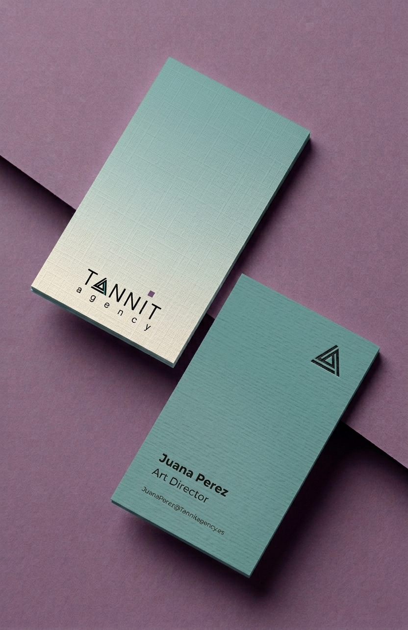
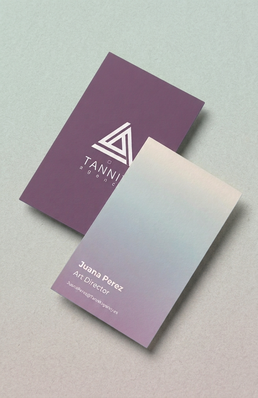
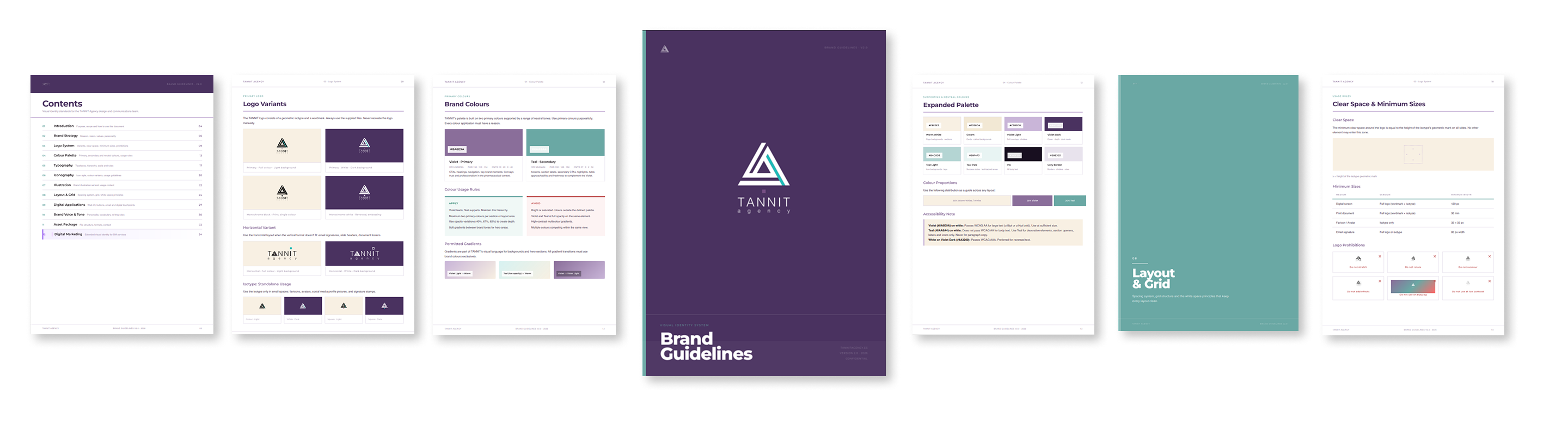
The original palette had eight or more colours with no hierarchy. The new system leads with two: a deep teal and a muted violet. Warm white and near-black complete the set — the kind of neutral ground that lets the two main colours do the talking.
Designed for decks, one-pagers, and email headers, with consistent stroke weight that holds at any size. Hover to switch between the two brand colours.
Two illustrations, each with a colour and a monochrome version. Clean linework, system colours only, sized to work across decks and one-pagers without adding visual weight.
One honest note. A third illustration is taking longer than expected. Past a certain point, forcing it beyond your current skill produces less than bringing in a specialist. A system built around transferable files outlasts whoever made it.
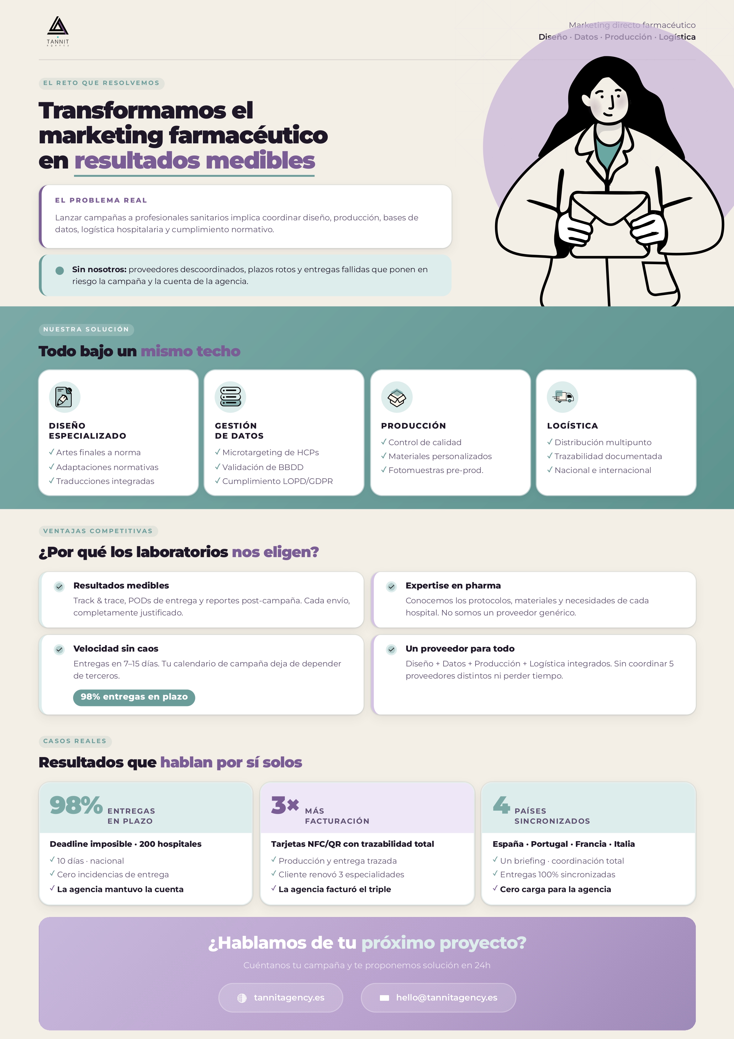
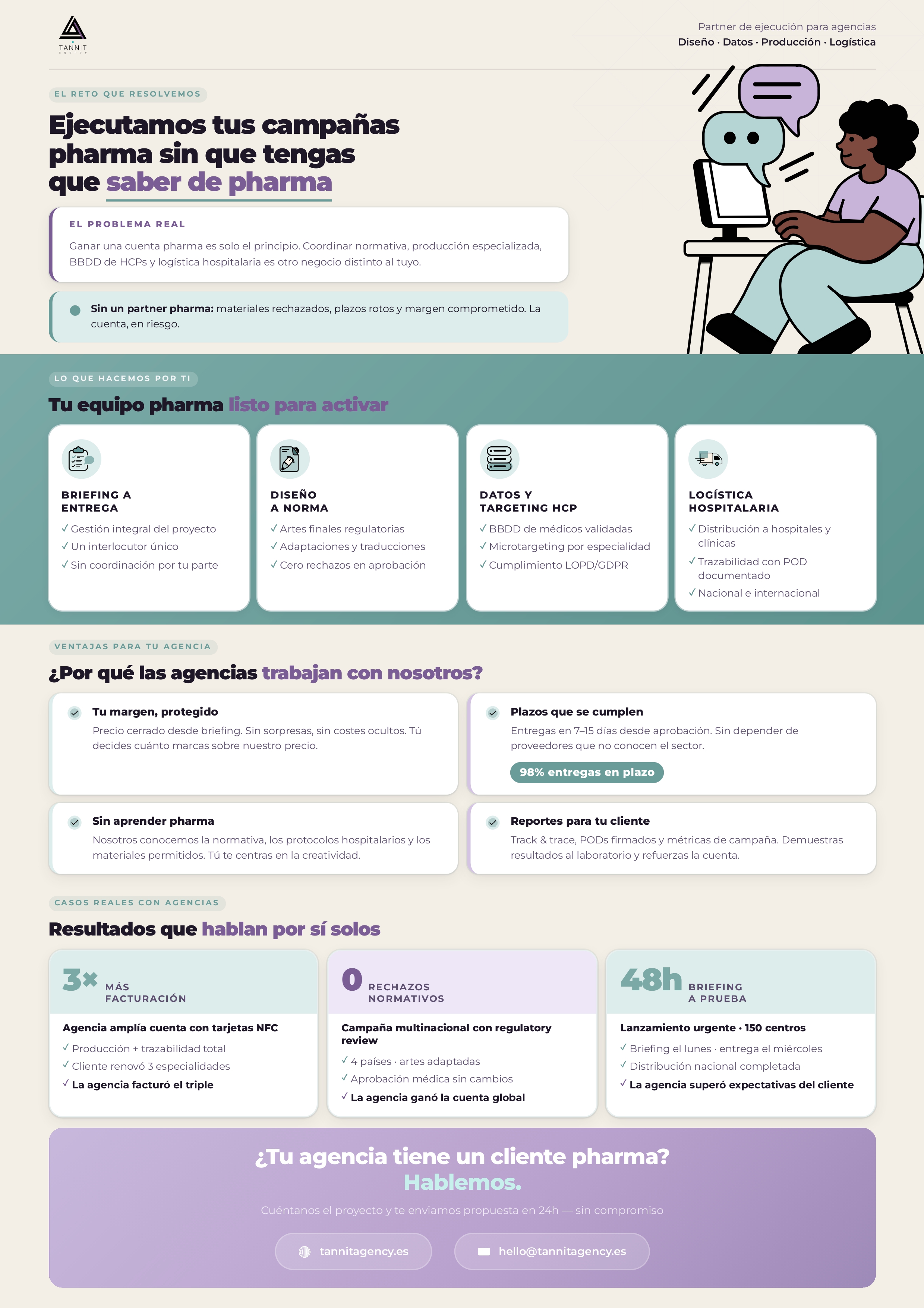
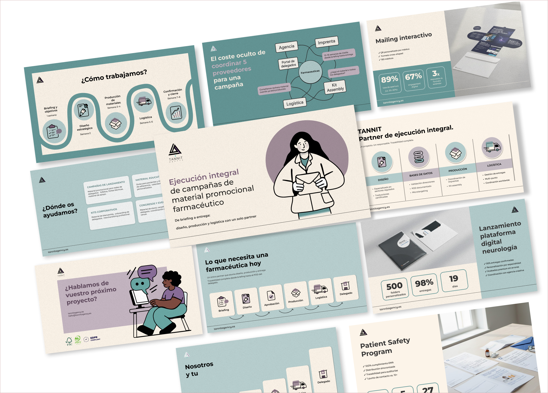
The pitch deck has a fixed structure with swappable content: the founders update cases and numbers each time, the layout stays. One grid and the same typefaces carry two completely different conversations.
The pharma version leads with compliance, traceability, and rigor. The agency version leads with white-label execution and process clarity. The underlying system is the same.
I spent real hours animating illustrations: loops for social, motion variants for decks. Tannit barely uses either format. The work was technically solid and completely beside the point. Deliverables should follow how the client actually communicates.
The founders still build every pitch deck and email from scratch. A reusable template would have delivered more value per hour than any animation I exported. That's where the system should have started.
The illustrations follow the same pattern. Two pieces are in use; a third was planned and never delivered because it depended entirely on my availability. Files that any designer can open and extend are worth more to the client than files that require a call to me first.
Two founders, three women, one brief over dinner.
Tannit left with a system they can use on their own and a brand that says what they actually do.